About the Project
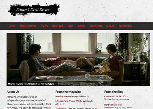
Printer’s Devil Review is an independent, open access journal of literary and visual art. We provide emerging writers and artists with access to publication and inquisitive readers with new voices and visions. We sell print editions at cost, but evey issue of the magazine is available for free download as a PDF (some are also available in e-book formats). We launched the site for the magazine, built in Drupal 7, in November 2011. More recently, we redesigned the site to allow users of mobile devices to more easily access our content.
When we first started the magazine, we considered Open Journal System (OJS), a specialized CMS used by many open-access scholarly journals. It had some appealing features; for example, it provided a form for writers to submit work and a workflow for editors to review works submitted to their sections. We found, however, that the choices for themes and layout were too limited. Further, our potential users (poets, writers, and artists) found the submission system frustrating and overly-complex. Before publicly launching the site, we switched to Drupal.
Drupal offered us a much wider range of theme choices as well as the resources and documentation needed to create one of our own. This is important because, in evaluating a literary journal, readers and potential submitters consider the design of a magazine almost as carefully as they do the content.
The Webform module also provided us with the means to create a customized submission form that is easy for submitters to use and stores all the information about submissions (files, author bio, etc.) in a table accessible to the section editors and exportable as a spreadsheet. Drupal also offered us a stable platform with a much more robust community of users and developers than other solutions. The Views module also made it easy for us to re-use content and produce RSS feeds that connect to social media platforms such as Facebook and Twitter.
We began with a customized version of the JournalCrunch theme but over time decided we needed to better serve readers accessing the site on mobile and tablet devices. As we considered a site re-design this summer, we were exited to find a number of base themes (e.g., the Omega theme, the Adaptive theme), modules, and documentation to assist in the process of transforming a fixed-width site into one that responds to a variety of screen dimensions.
It's no secret; most literary journal websites are pretty mediocre. It's not that the publishers of these journals don't care about their websites—even if they had the time to take away from the daily work of putting out a magazine, they don't usually have the design and development skills in-house to deliver the kind of user experience that readers have come to expect from commercial publications. These "little magazines," as they're called, also don't have the money to pay for innovative site development.
We decided early on, though, that it was important that the design of the Printer's Devil Review site receive the same level of attention as the design of our print issues. There are a lot of literary magazines out there, and we knew a well-designed web site could help us stand out in a crowded field. More recently, we recognized the importance of reaching our users wherever they are, on nearly any device.
So, on to the technical nitty gritty.
Submission System
A magazine lives or dies based on its content—the stories, poems, and essays that make people want to read it and hopefully subscribe. Getting good content depends on contributors making submissions, so the submission system needs to be easy to use and reliable. The Webforms module allows us to provide a simple form for submissions without relying on a link to a vendor-provided solution (such as Submittable). Users must create an account on the site in order to access the webform, but we simplify this process by using the Facebook OA Auth module. Allowing users to log in to the site with their Facebook account means that they don't have to manually create (or remember) a log in to a submission form that they probably only use once or twice a year.
Visual Identity
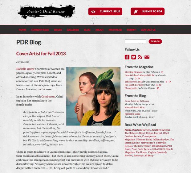
Let's talk type. Part of the magazine's visual identity has to do with our attention to typography and we wanted that to carry through to our website. Before our redesign, we consulted a recent study by Smashing Magazine about typographic design for the web and wanted to adopt some of the new trends, especially web fonts. Making use of the @fontyourface module, we were able to take advantage of the free web font Lato from Google Fonts for our sans serif text. The Typogrify module added some flourishes and ensured that we never committed the typographical heresies of using dumb quotes instead of smart quotes or hyphens for en- and em-dashes.
 Sometimes it's the little things. Specifically, icons and buttons. Although it's not a Drupal module, we have to give a shout-out to the IcoMoon App. This free site provided us with access to a wide selection of icon fonts under open licenses to use in our design. Further, we were able to choose just the icons we wanted from multiple fonts, create a customized icon font of our own, and serve it up from our site. The total file size of the icon font we serve to the user is considerably smaller than the file sizes the icons would be if they were all individual images. Bottom line: these font-based icons load faster and look better. We integrated some of these icons into distinctive buttons with CSS3 transitions (e.g., "Current Issue" and "Submit to PDR" buttons). Credit where it's due, we based the design on creative button designs by Manoela Ilic at Typmanus.
To make our design stand out, we also made use of some other CSS3 techniques: text shadows; @fontface to bring in the icon font, color RGBa declarations to create a transparent horizontal menu bar, footer, and slideshow captions without impacting the transparency of the text; border-radius to create curved boxes around captions; and so forth.
Responsive Layout (Theming with Omega)
 The major goal of our redesign was to improve the user experience of readers accessing the site on mobile and tablet devices. Using the Omega theme along with the Omega Tools module, we were able to very quickly create a sub-theme and start making distinct layouts for different breakpoints. For example, using the mobile-first structure of Omega's CSS files, it was easy to code a horizontal menu for a wide viewport (laptop or desktop) that transforms into a vertical menu in a narrow layout. With an icon, some CSS to hide and display the menu, and a three-line JQuery file to toggle the state on and off, we have a menu that starts out concealed in a narrow viewport and then unfurls when the user taps the icon.
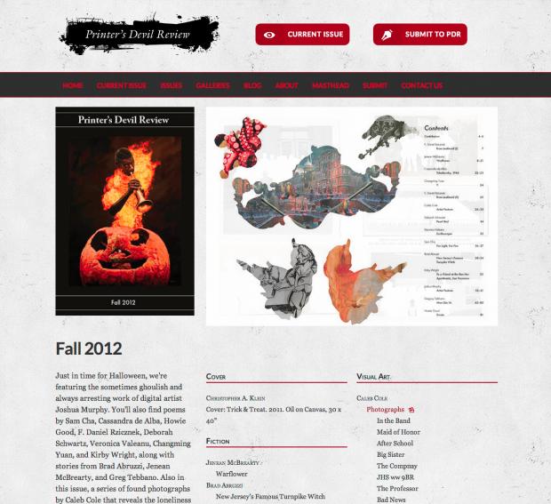
The Delta module provided us with a great deal of flexibility in creating alternate layouts. We use these, along with the Context module, to customize the layout of the home page as well as pages for issues and pages designed specifically for reading content. Issue pages feature cover art paired with a Views slideshow of pages from the print layout of the magazine. Pages meant for reading individual stories and poems, by contrast, have been cleared of all sidebar clutter so that the user can focus on reading the text
Finally, because we use the Views Slideshow module extensively, we're grateful to the code posted here by mrcorbtt and Kristen Pol that makes the slideshows responsive.
Workflow
As a designer, one of the challenges of redesigning the site was developing an efficient workflow. Because the site was already live, I opted to do my development on my local machine using MAMP Pro and a snapshot of the site database downloaded with the Backup and Migrate module.
The Omega theme made it easy for me to integrate the CSS Compiler SASS (in combination with Compass) to write the final CSS that governs the presentation of the site. I worked in SASS on a set of SCSS files while Compass watched for changes and updated the corresponding CSS files. My local sub-theme served as my git working directory and when I made significant changes, I committed these to my Github repository.
There were a couple of tools that made responsive testing much easier. One was RWD Bookmarklet, which allowed me to quickly check how my design was looking at some common breakpoints. Later, I discovered a great article by webthingee (Sean Lange) at Lullabot about a service called xip.io. With xip.io, I was able to test the site sitting on my localhost on my iPhone and other devices—how cool is that?
When I was ready, I pulled changes from my Github repository to the (disabled) sub-theme on the live site. Sometimes I wanted to try out some aspect of the new sub-theme on the live production site, but without causing problems for any users who might be on the site using its current theme. I used the ThemeKey UI module to apply the new subtheme to the site only for me and was able to view how my changes would look.
I can't overstate the usefulness of Drush to my development process. Being able to quickly clear caches from the command line, download and enable new modules, and perform other site-related tasks quickly greatly accelerated my work. When I was finally ready to deploy the new theme on the live site with all its new modules, contexts, deltas, views, and so forth, I wrapped all of these up into a package using the Features module. (I had some blocks I wanted to bring in as well, and the FE Block2 module made that possible.)
The code for the theme is probably too specific to just be contributed to the community—it relies on a number of CSS classes defined by views, blocks, etc. in my particular instance of Drupal. However, I've made the theme available at my GitHub repository for anyone who thinks they might find something of use there: https://github.com/tdodson/pdr_omega.
This case study is also available on Drupal.org.